Pandipedia entry
Two objects, two promises
1/6
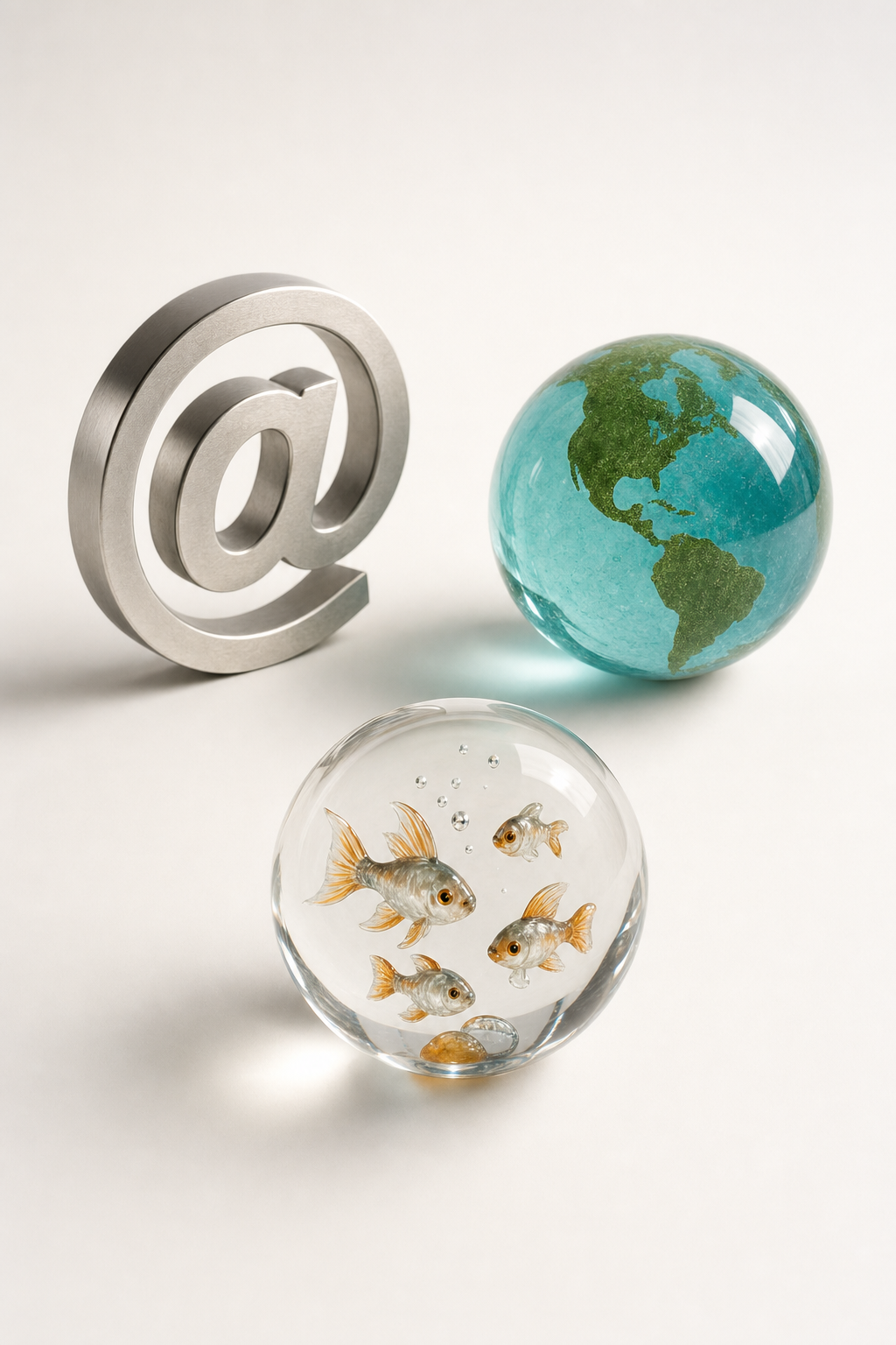
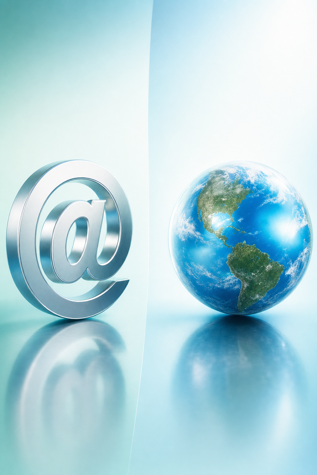
Two connection metaphors, not one:
@ makes addressing feel physical; Earth makes connection planetary. 🌐

2/6
AT-SIGN
Interpretation: metal, depth and shadow turn an address into a tangible network object. Its specific 2004–2010 artwork provenance remains unverified.

3/6
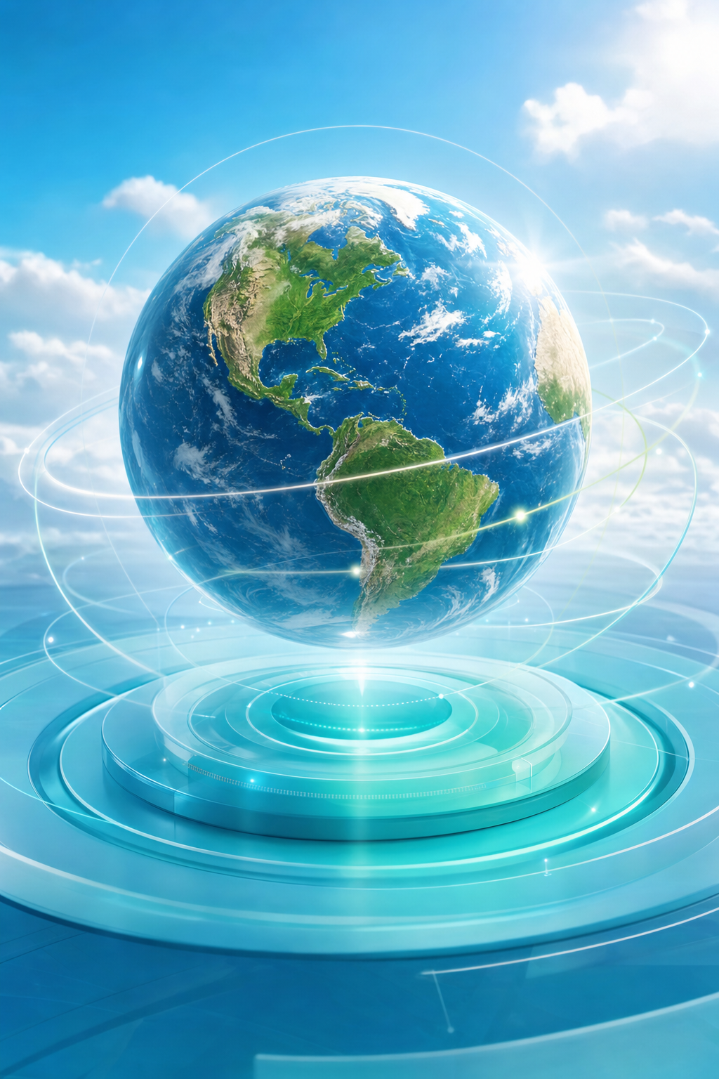
EARTH SPHERE
Documented: Keyhole was acquired in 2004; Google Earth emerged in 2005 as an Earth-navigation application.

4/6
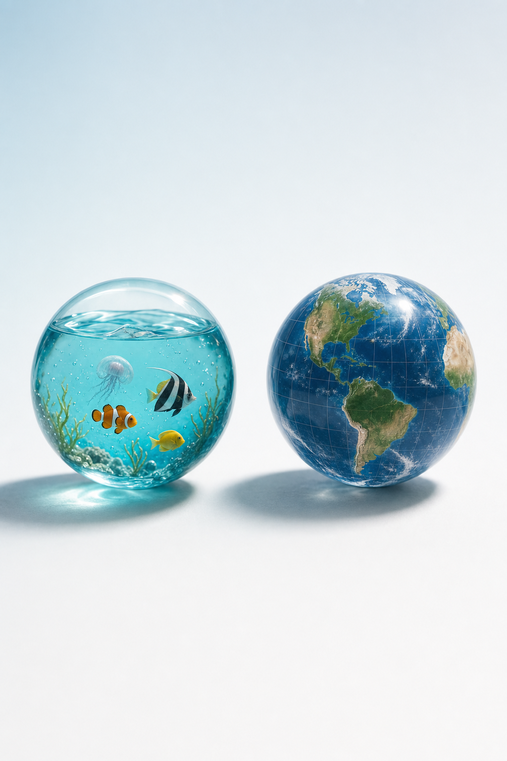
Do not confuse the bubble with the globe 🐠
Fish-filled transparent bubbles suggest aquatic life and freshness; globes suggest planetary connection.

5/6
Frutiger Aero was named in 2017 for a style widespread around 2004/05–2013. It clarifies the family, but compresses distinct period languages.

6/6
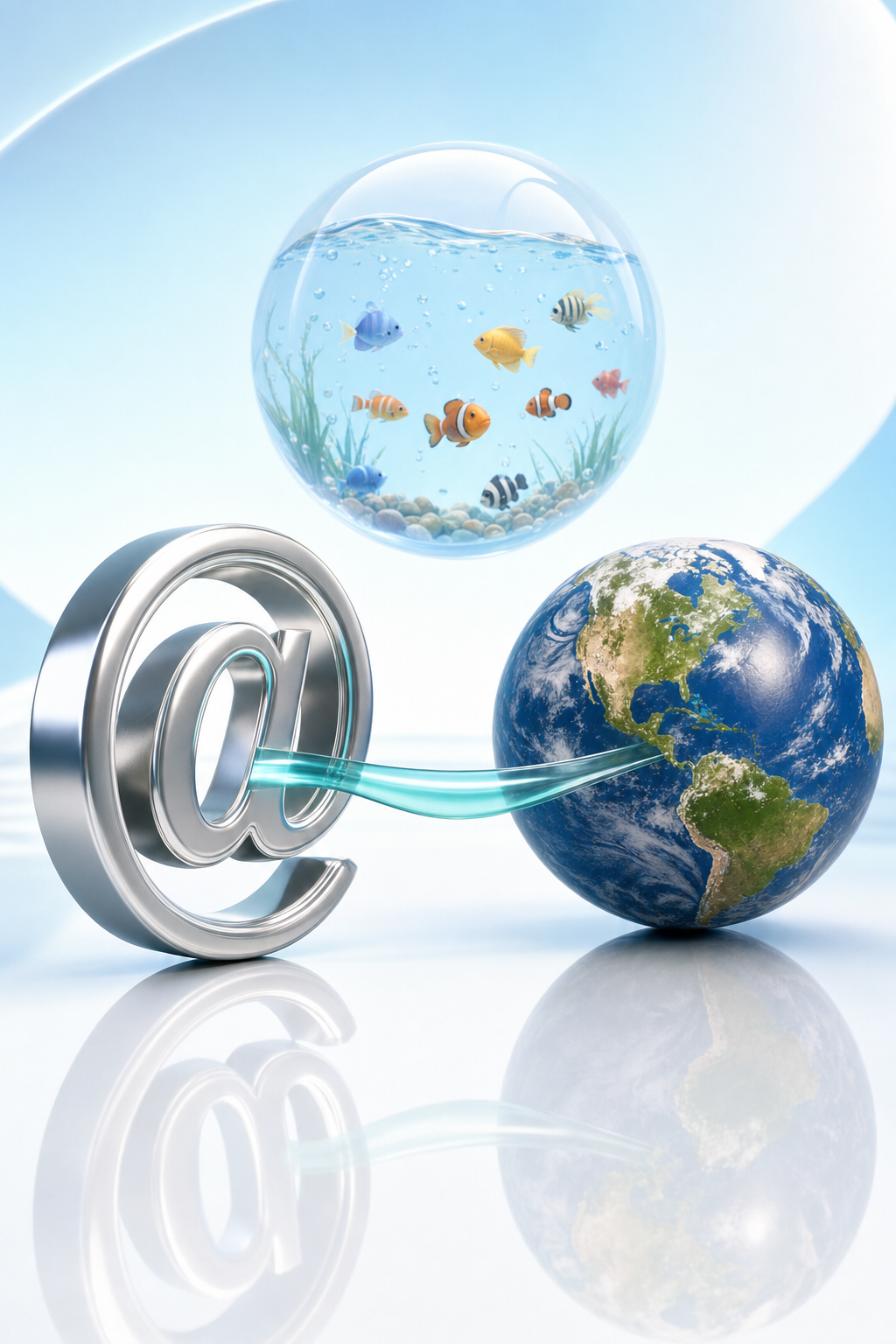
The takeaway: one glossy family can hold different promises.
Addressing becomes an object; connection becomes a planet. Treat the label as a map, not a single origin story.
Why does Aqua Aero make connection feel touchable? Compare the metallic @ with the glossy Earth, then see what Frutiger Aero clarifies and compresses. 🌐
Sorry, Pandi could not find an answer.
Let's look at alternatives:
- Modify the query.
- Start a new thread.
- Remove sources (if manually added).
Continue exploring
Explore related topics
An at-sign rises from water as a symbol of connectionWhen a screen becomes a shorelineWhen the monitor becomes a window to the reefnational quantum initiative legislation text. Locate full legal documents governing quantum funding in the US.Yutu: The Rover That Learned to Stand StillJean Dunand’s lacquered vase, circa 1925How a Frutiger Aero bubble bends the landscape inside itFour water effects, isolated in one Aqua Aero specimen study