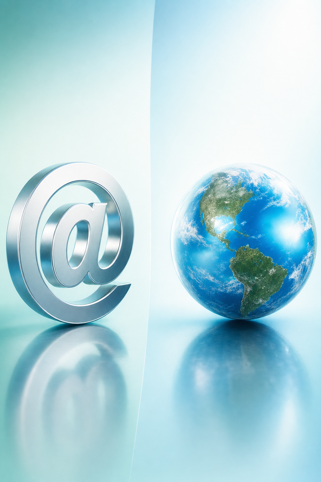
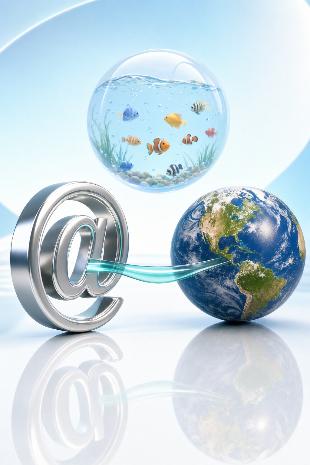
Two connection metaphors, not one:
@ makes addressing feel physical; Earth makes connection planetary. 🌐
Connection metaphors
2/6
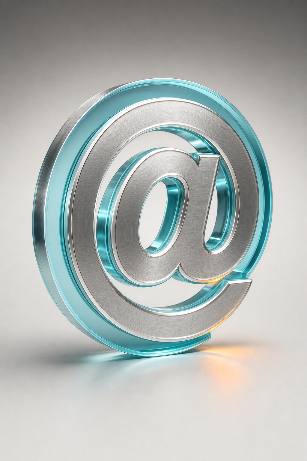
AT-SIGN
Interpretation: metal, depth and shadow turn an address into a tangible network object. Its specific 2004–2010 artwork provenance remains unverified.
Connection metaphors
3/6
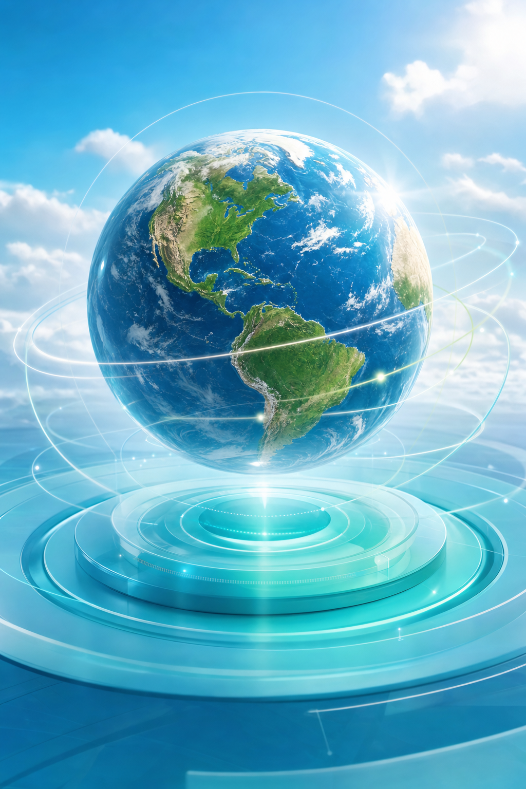
EARTH SPHERE
Documented: Keyhole was acquired in 2004; Google Earth emerged in 2005 as an Earth-navigation application.
Connection metaphors
4/6
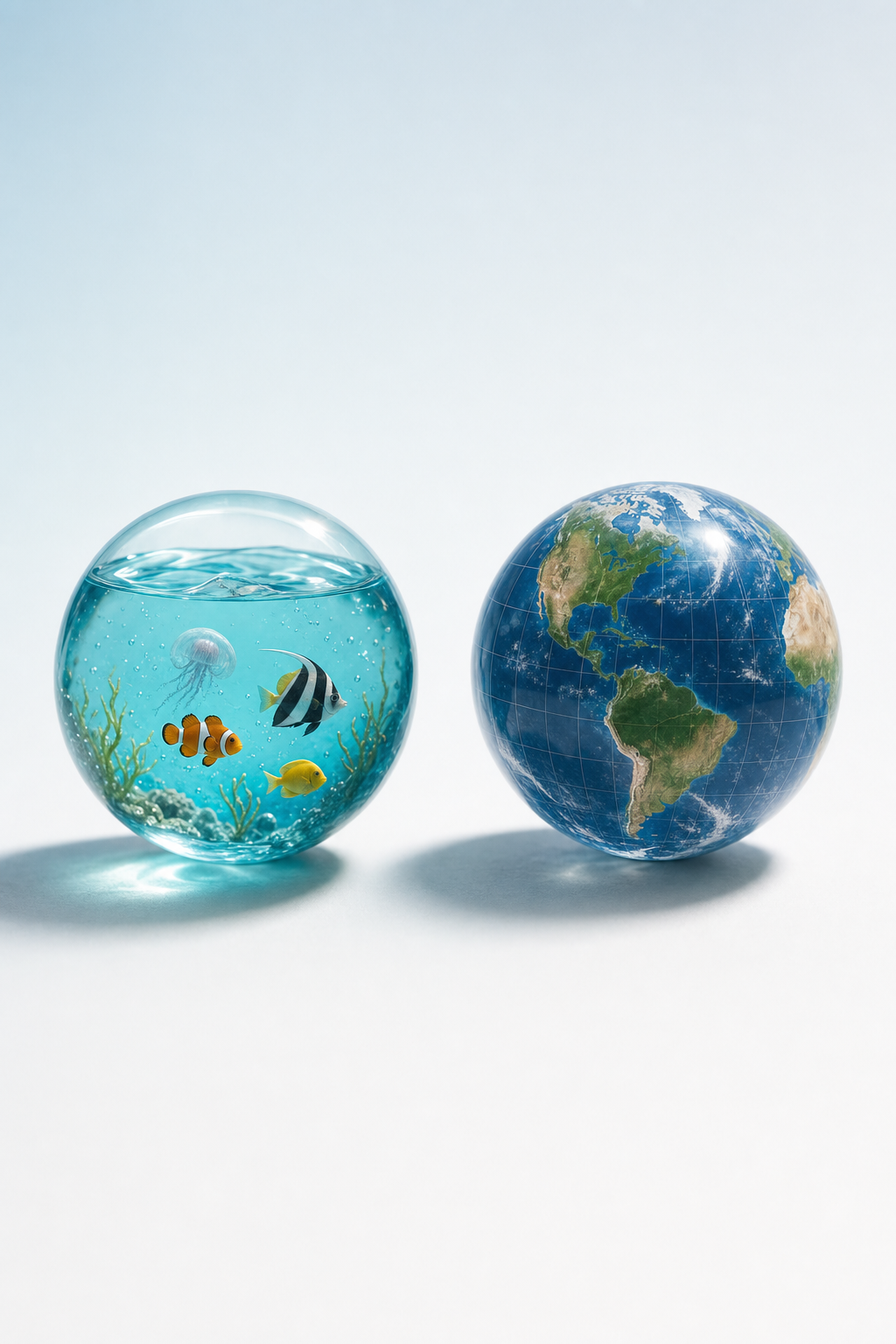
Do not confuse the bubble with the globe 🐠
Fish-filled transparent bubbles suggest aquatic life and freshness; globes suggest planetary connection.
Connection metaphors
5/6
Frutiger Aero was named in 2017 for a style widespread around 2004/05–2013. It clarifies the family, but compresses distinct period languages.
Connection metaphors
6/6
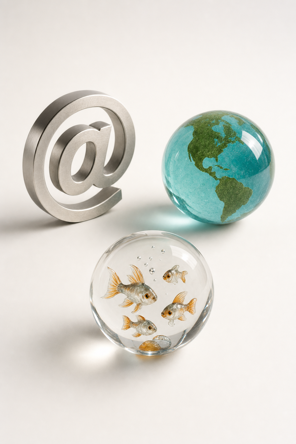
The takeaway: one glossy family can hold different promises.
Addressing becomes an object; connection becomes a planet. Treat the label as a map, not a single origin story.
Why does Aqua Aero make connection feel touchable? Compare the metallic @ with the glossy Earth, then see what Frutiger Aero clarifies and compresses. 🌐
Lo sentimos, Pandi no pudo encontrar una respuesta.
Veamos alternativas:
Modifica la consulta.
Inicia un nuevo hilo.
Eliminar fuentes (si se han agregado manualmente).