
Why skeuomorphic UI is coming back
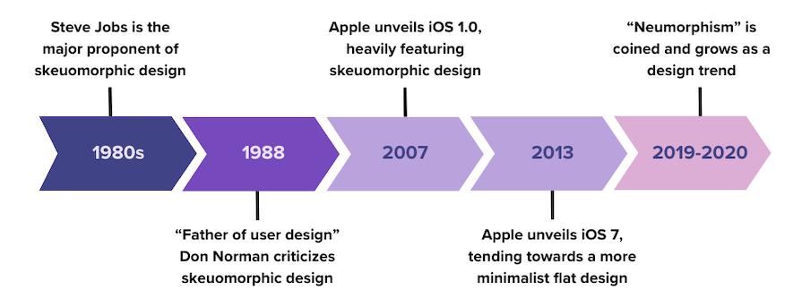
Skeuomorphic UI rose by copying the physical world, faded with flat design, and is now creeping back in softer 3D forms. The big question: why do digital interfaces keep swinging between realism and minimalism?[7][9][22]

Early GUI design leaned on familiar objects like trash bins, folders, floppy disks, and calendars so new users could learn faster. That is skeuomorphism as a learning aid, not just eye candy.[7][1][9]

Apple took it to the max: iOS 6 Notes looked like yellow paper, Newsstand looked like a bookshelf, and Voice Memos used realistic materials. AppleInsider says iOS 7 then stripped that away for a flatter, less literal look.[2][11]
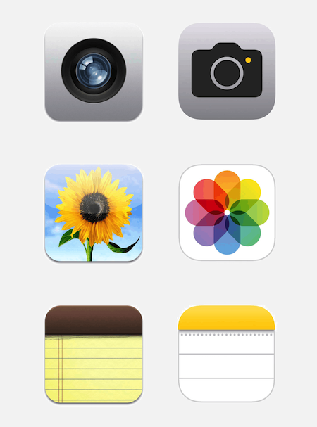
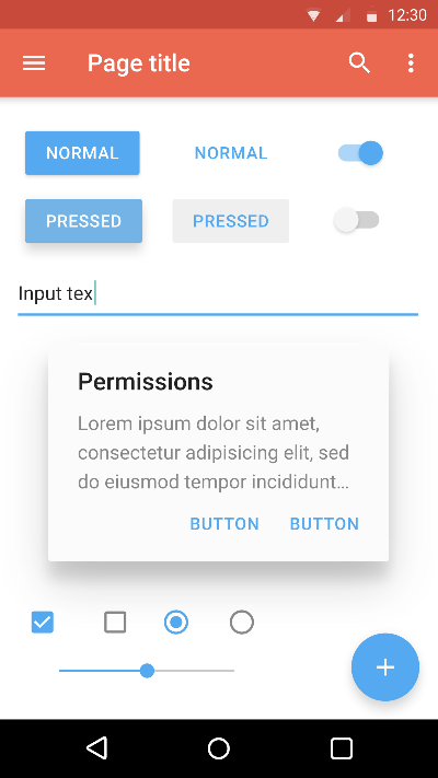
The backlash was practical, not just aesthetic. Sources cite clutter, larger screen use, slower load times, and higher cognitive load as reasons skeuomorphism lost favor to flat and material-style systems.[7][8][13]

Veiem alternatives:
- Modifica la consulta.
- Inicia un nou fil.
- Elimina les fonts (si s'han afegit manualment).