Pandipedia entry
AD
Two Posters, Two Styles

1/6
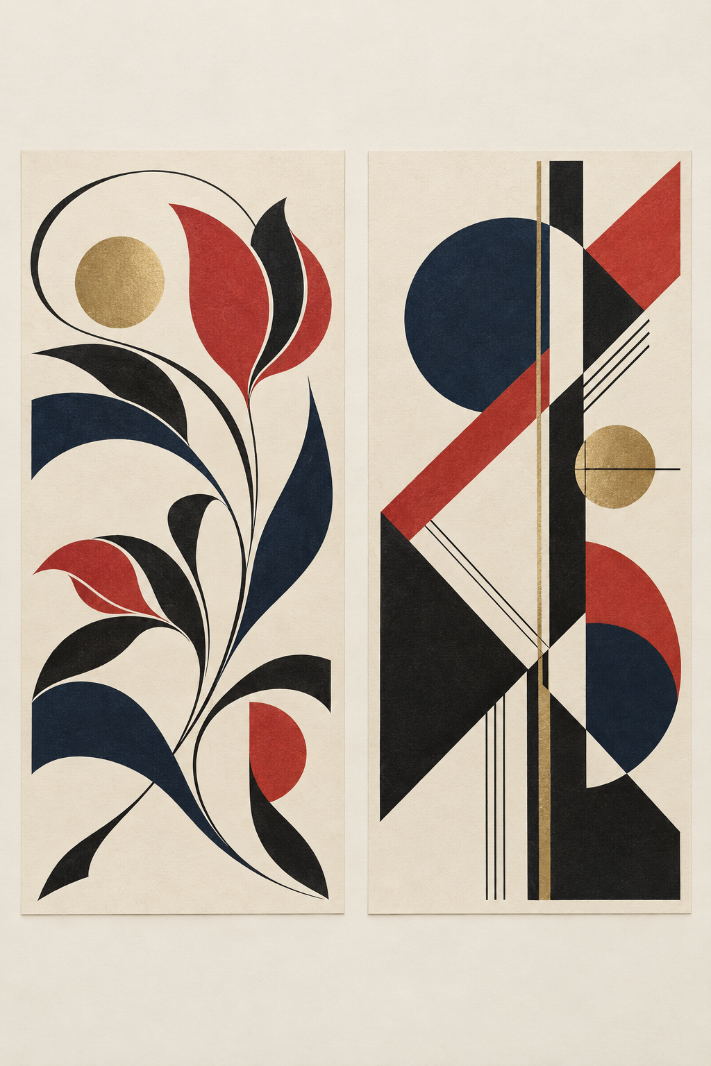
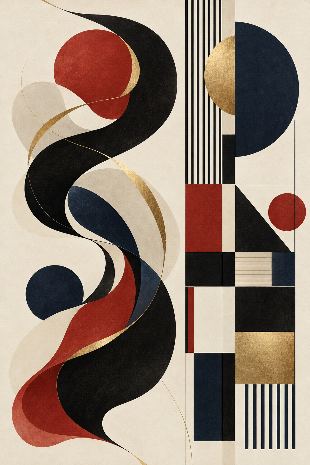
Two posters, two visual languages: Mucha’s *Job* (1897) and Cassandre’s *Nord Express* (1927). What changes in the line? 👀


2/6
Mucha’s *Job* is dated 1897; Cassandre’s *Nord Express*, 1927. This is a 30-year comparison, not a rule for every work. ✨

3/6
My reading: *Job* lets ornament lead; *Nord Express* feels more geometric and machine-age. That’s a reading of these examples, not a movement-wide rule. 🔎

4/6
Craft clue: MoMA records *Nord Express* as a 1927 lithograph, 41 × 29¼ in. 🖨️

5/6
Read as poster design, each makes style do public-facing work: flowing ornament invites the eye; geometry can suggest speed and order. ✨

6/6
Takeaway: these examples suggest a move from flowing ornament toward geometric machine-age styling, not a clean break. Their display places and specific ad purposes aren’t documented here. ✅
A close comparison of two posters: what ornament, geometry and machine-age styling can show, without turning two examples into a universal rule. 🔎
Sorry, Pandi could not find an answer.
Let's look at alternatives:
- Modify the query.
- Start a new thread.
- Remove sources (if manually added).
Continue exploring